DOMUS AUGUSTA CORPORATE IDENTITY
AREA: Private, Events, Receptions.
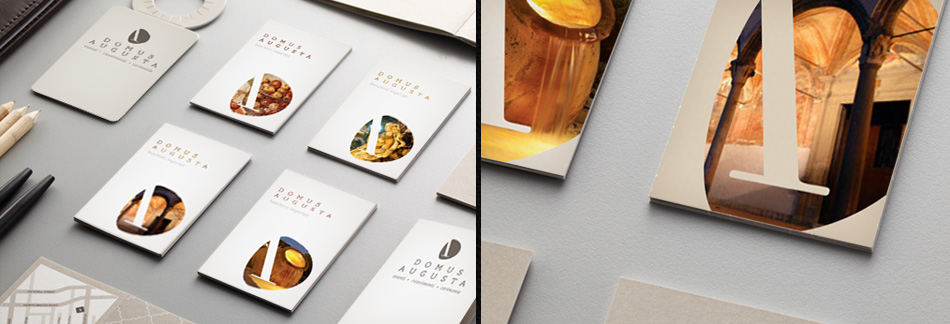
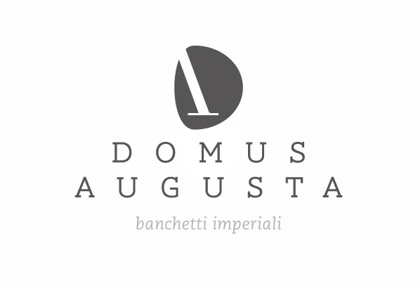
CONCEPT: A monogram obtained from the letters "D" and "A", the company name's initials. The D is shaped by a curved, dynamic sign which encompasses part of the A - a rigid, solid character typical of the Roman age. The two elements merge into one sign with clear references to classical and modern styles. Different colours characterise the photos of various visuals, making the brand a suitable container for the company's many communication needs.
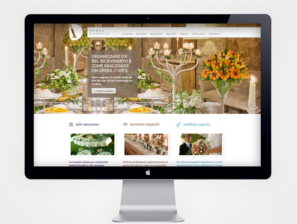
ADV: The naming chosen links the company to the Vesuvian area where it is based, and which was a favourite destination of Roman emperors. The pay-off "imperial banquets" highlights the quality of the catering, a strength of the domus and of its surroundings, which are home to many excellences.
WEB: www.domusaugustaricevimenti.it
TAG: naming - logo - brochure - website - menu
details