SPAZIO ABILE DISABILITY DAY CARE CENTRE
AREA: Private, Social health.
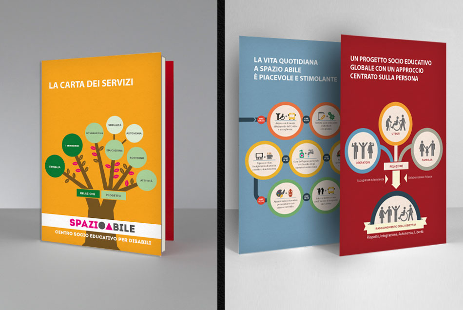
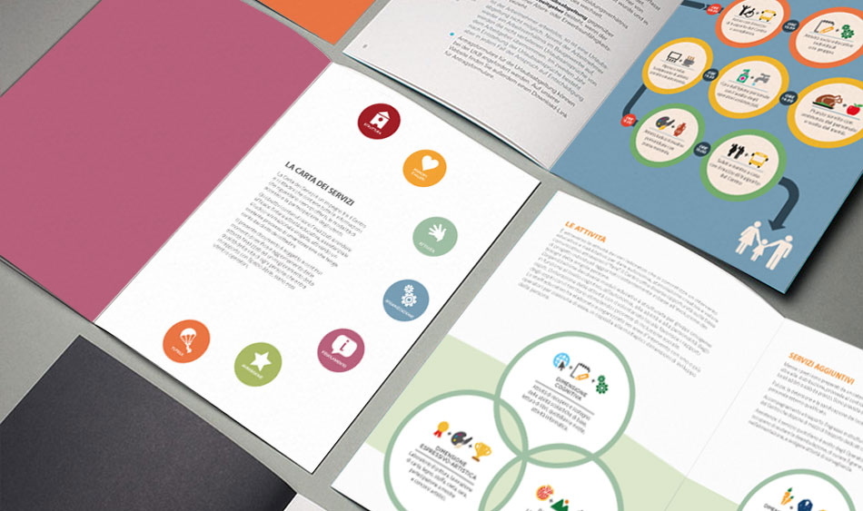
CONCEPT: The two stylised letters in the logo express two key concepts: O standing for centre, where to meet and interact, and A standing for the ideal triangle - home, family, and care. The name and infographics, showing an intentionally 'school-like' trait, express the centre's philosophy: a creative, stimulating place where different resources and competences come together to support and interact with disabled people.
ADV: This marketing and health communication project offers quality operational procedures, effective communication with the users and appropriate technical support to promote the image of the Spazio Abile centre, presenting its services as 'excellences' in the social health market.
TAG: naming - logo - service charter - text writing - infographics - layouts

details


